

As far as we know, there are no medieval texts that tell us about the reactions of a viewer to an English alabaster. As is often the case, these can only be deduced indirectly by putting into perspective the information gathered from other sources..
The spectators: clients and commissioners
Before asking how a medieval viewer could appreciate the polychromy of alabasters, it seems necessary to better define their typical social profile. In other words: for whom were these works intended? The data we have suggest that their clientele was very broad, drawn from all strands of society and from a large number of European countries.
Indeed, despite the massive losses they suffered during the Anglican Reformation and the Civil Wars, more than 2,400 panels still survive.1 The large number of surviving works shows that in the Middle Ages this production was probably unrivalled in terms of its success with a very large number of customers, from a fairly broad cross-section of society.
Contrary to what has sometimes been claimed, this success was not limited to those sections of society with modest means.2 Among the few known buyers of these works, we find not only middle-class people, but also ecclesiastical dignitaries and members of the aristocracy. The export of three statues from England to Rome in 1382 by the representative in England of Pope Urban VI, Cosmato Gentilis, is well known. Pey Berland (1432-1456) and Arthus de Montauban (1468-1478), both archbishops of Bordeaux, were purchasers of alabaster altarpieces and statues.3 It seems plausible that the panels in the collegiate church of Montpezat de Quercy, which were part of the altarpiece of the main altar, were commissioned by its founder, Cardinal Pierre de Prés.4 The altarpiece of the Five Joys of the Virgin, which was once in the Chapel of the Virgin in the Benedictine Abbey of Novalesa (Piedmont), was probably commissioned by abbot Giorgio Provana (before 1478-1502).5 In 1442, the prior of Modbury (Devon) commissioned an altarpiece to be sent to his mother house, the abbey of Saint Pierre sur Dives (Calvados).6 In 1481, two English alabastermen claimed payments from the abbot of St Albans, the prior of Holy Trinity in Wallingford and the keeper of the hospital of St Bartholomew in Newbury (Berkshire) for altar panels delivered to them.7
Among the clients of the English alabaster sculptors were also noblemen, such as Mary of St Pol, dowager countess of Pembroke,8 and the English king Henry VIII, who – in addition to the particularly expensive altarpiece in Windsor Castle commissioned by his predecessor Edward III – also owned an image of St John.9 The altarpiece of St Léger in Nouâtre (near Tours) was most probably acquired by Jean du Fou, chamberlain to King Louis XI and patron of the church’s construction in the 1480s.10 The small altarpiece of the Virgin from Castropol was probably commissioned by Diego García de Moldes, a member of an important Spanish family.11 According to the information gathered by Zuleika Murat, several altarpieces in the Italian peninsula belonged to important princely courts, such as that of the Este family in Ferrara, the Anjou-Durazzo dynasty in Naples and the Visconti family in Milan.12
Given the considerable financial means available to these elites, their choice of English alabasters cannot be explained by the low price of this production. Since the alabasters acquired by the nobility and the high clergy show the same artistic quality as the other panels, it can be deduced that the entire production, or at least a significant part of it, satisfied the taste of even the most demanding clients.

As the cosmopolitan nature of the clientele mentioned above illustrates, English alabasters were not popular just in the region where they were produced, nor even only in their country of origin. They were bought in almost all the countries of Catholic Europe, from Iceland to Croatia and from Portugal to Poland and Norway (fig. 68).13 Their visual appeal has thus clearly freed itself from any local particularism to become an international art form, appreciated more or less everywhere.
It should be noted that most of the alabasters that have come down to us with sufficient documentation – at least in the case of altarpieces comprising several panels – were acquired by commission. It is true that a certain number of them arrived on the Continent in order to escape the destruction carried out in the context of the Anglican Reformation, which may have meant that the works were sold at low prices and acquired under conditions where chance played an important part.14 However, this phenomenon probably primarily concerned the northern coasts of France from Calais to Brittany, which were easy to reach by boat from England.15 Works preserved in more distant countries, such as the altarpiece of Santiago de Compostela (donated in 1456), that of Mondoñedo (mentioned in 1462),16 several altarpieces, panels and statues from the Bordeaux region (commissioned in the 1430s or 1440s) or the vast majority of works preserved in Iceland, arrived there before the 1530s.17 The small altarpiece of the Virgin of Castropol (Asturias) was probably commissioned and shipped around 1461,18 the panels of Montpezat en Quercy are mentioned as early as 1436, and already in 1390 an English ship carrying alabaster images was bound for Seville.19 English alabasters were therefore most often selected in preference to other locally produced works, especially when they were commissioned outside England, without competition being distorted since, in the context of Reformation, these works could be purchased at low cost.
The English alabaster painters were thus clearly capable of developing a ‘formula’ for colouring their works which, it is suggested, was very successful with a wide and diverse clientele. What inferences can be drawn from the specific features of this polychromy about artistic taste at the time? Why was the selection of a small number of tones preferred instead of using multiple and diversified colours? What values did these customers attach to light and dark colours? What might have been their attitude to the surface appearance of colours, especially mattness and gloss?Only medieval writings can provide answers to these questions. Given that these texts often emanated from the elites, the observation stated above that alabaster panels were also intended for them is important. If it had indeed been a ‘popular’ art, as some scholars have tended to believe, the appeal to clerical or aristocratic texts that follows would be of little relevance.20
Purity and intensity of colour
Let us first recall that colours were not perceived, classified and appreciated in the Middle Ages in the same way as they are today. As the studies of Brent Berlin and Paul Kay21 or Michel Pastoureau, among others, have shown, the way of naming and distinguishing colours can differ greatly from one period to another, and from one culture to another. Without going into detail, which would take us too far from our subject, let us simply point out that in the Middle Ages, colours were not classified according to the spectrum of visible light, which was only discovered by Newton in the seventeenth century, and that white and black were included among the colours in the same way as red or green. A certain number of colour shades, such as orange, were not considered to be colours in their own right, and there is no term to name them.22 These differences should be kept in mind for what follows.As already mentioned several times, English alabaster painters used only a small number of colours. What these colours had in common was their high degree of saturation, usually obtained from pigments that were not mixed (apart from pink). They mainly comprised red (cinnabar), green (verdigris or copper resinate) and, less frequently, blue (indigo or azurite). The colouring was done not only with pigments, but also with gold, which replaces the yellow colour, and alabaster, which takes the place of white.
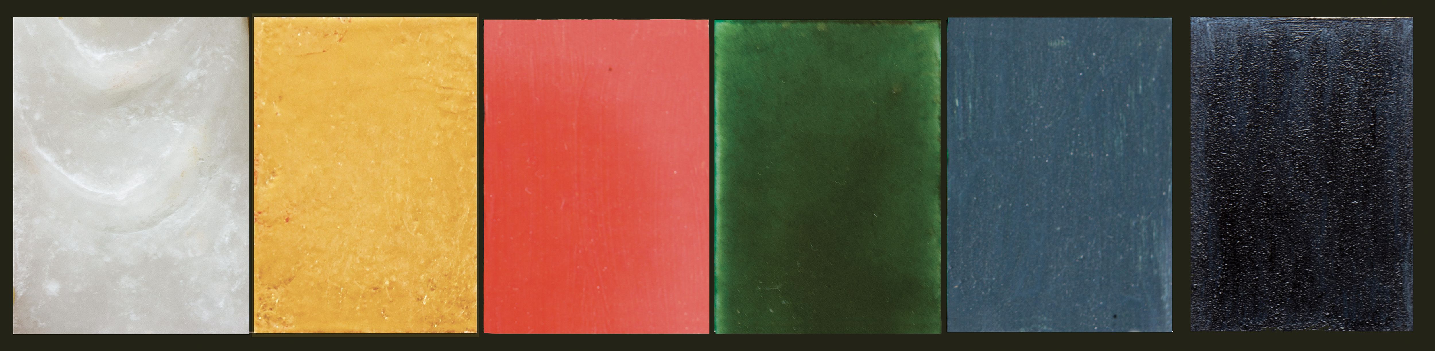
This highly restricted range of colours corresponds to what the Middle Ages might have considered the ‘primary’ or main colours. The chromatic values selected closely resemble the range which, according to Michel Pastoureau, appears most often in medieval treatises on colour, composed of white, yellow, red, green, blue and black (fig. 69).23 This scale is itself based on Aristotle’s reflections on colours (De Sensu, 4.442), which medieval authors often quoted explicitly.
What medieval thinkers retained from Aristotle’s theories on colour is first of all their very small number. The diversity of colours is not infinite, but is reduced to only six or seven. As Bartholomaeus Anglicus states, “there can be neither more nor less”.24 Like those of alabaster, the colours of this palette are distinguished by both their purity and their intensity. The existence of shades is not denied, but they are considered mere ‘accidents’ (accidentum colorum),25 understood in the metaphysical sense of the term, as opposed to their essence, which is pure colour. Or, to put it in other terms, those of medieval neo-Platonism, they are imperfect actualisations of the idea of this or that colour (as pink or orange-red are imperfect actualisations of red).26 In other words colours where the saturation has been decreased or toned down do not reach the degree of perfection of the most intense colour. As Michel Pastoureau has noted in relation to medieval dyes, it is primarily the intensity of the colour that distinguishes the royal garment from the clothes of the peasant.27 It is therefore the high saturation of colours that was sought and appreciated.
In the Middle Ages, the degree of intensity was a necessary quality for a colour to be considered beautiful, but it was not sufficient. Red lead or red ochre, for example, are as intense and saturated as cinnabar. However, only cinnabar (or almost only cinnabar) is used to colour the visible parts of alabasters; red lead and red ochre, on the other hand, are mostly used in mixtions and are therefore destined to ‘disappear’ under the gold-leaf. Among the three saturated reds, it is clearly the ‘purest’, most ‘archetypal’ shade that has been preferred. Unlike the orange-red of red lead or the brownish-red of ochre, the red of cinnabar has no yellow, violet or brown undertones. In this sense, cinnabar red can be considered as the tone that best embodies the very idea of red (in the Platonic sense) – just as gold perfectly embodies that of yellow and alabaster that of white.28
It should be remembered that in the Middle Ages, mixtures of colours were generally disparaged. As Michel Pastoureau notes, there was an aversion to mixtures, inherited from biblical culture, that permeated the entire medieval sensibility. Mixing, blending, merging, amalgamating were often considered infernal operations because they violated nature and the order of things intended by the Creator.29 According to the herald Sicille, the colour purpura is obtained by mixing all the other (heraldic) colours. The author reports that according to some, it is the least appreciated of the colours, because it has no particular virtues, only those conferred on it by the other colours.30 The mixing of white, black and red – the colours considered in the Middle Ages to be the most strongly opposed to each other – creates a particularly ugly colour called ‘riolé-piolé’.31 The disdain for mixtures and the valorisation of the purity of colours by medieval man probably also affected his way of appreciating the polychromies of alabasters, which were essentially composed of pure and ‘perfect’ colours.
The accumulation of a large number of these pure colours, such as we find on the alabasters, was apparently not scorned; on the contrary, this was not the case at least as long as these colours were not located on the same plane. According to Michel Pastoureau, in fact, “the medieval eye often attached more importance to the thickness of objects and images than to their extent, and never confused these two parameters. In the thirteenth century, for example, wearing a white shirt, a blue tunic, a green dress and a red cloak was not the same as wearing a variegated outfit [because the colours were superimposed]. On the other hand, to wear a tunic or a dress with red, green and yellow stripes is to wear a polychrome, and is therefore an ugly, indecent or degrading garment” [because the colours are juxtaposed in the same plane].32 The colouring of the clothes of most of the figures on the alabasters corresponds perfectly to this principle: the red lining of the cloaks is located ‘underneath’ their white obverse, and is superimposed on the white obverse of the dress, which is itself placed ‘on top’ of a blue lining (fig. 14, 19, 20). The semé, like the daisy flowers on the green backgrounds, should also be ‘read’ as a foreground superimposed on a plain background. Furthermore, the organisation of the coloured surfaces as semé or a pattern of charges on a monochrome field was highly valued in the field of heraldry;33 the same was probably true of alabaster.
Colour and light
Let us return to Aristotle’s conceptions of colour. In addition to the highly restricted range of colours, the Middle Ages in general and English alabasters in particular inherited the strong correlation between the notions of colour and light from the Greek philosopher. Like medieval thinkers, he understood that green and blue were not as bright as yellow. Following on from Aristotle, medieval classifications form a scale from the brightest to the darkest colour: white is inextricably linked to intense light, while black is nothing other than a total absence of light.34 As the other four or five colours, called ‘medium’ or ‘intermediate’, lie between these two poles, they ‘necessarily’ contain more or less light. If red holds a middle position between the two extremes, the ‘pale’35 and yellow, placed near white, are deemed luminous, while green and blue, being near black, are dark, so to speak, by nature.36 Significantly, the most common medieval term for the colour violet – which is sometimes included in this range and then placed between blue and black – is ‘subniger’, i.e. ‘sub-black’ or ‘blackish’.37 Similarly, ‘pale’ is described as a kind of white ‘declining a little bit towards obscurity’ (declinans aliquantulum ad obscuritatem).38 It is therefore more the degree of luminosity that defines the colour – or rather the way in which it is perceived and categorised – rather than the colour shade itself, which can vary considerably from one ‘pallidus’ or ‘subniger’ to another.39
The dark or obscure character that, according to this view, is inherent to blue may explain some of the remarks by medieval authors that would otherwise be difficult to understand. Albertus Magnus (c. 1200-1280) described the colour of lapis lazuli as ‘pale blue’,40 whereas we would rather speak of a strong, intense blue. Bartholomaeus Anglicus and the herald Sicille, for their part, stated that indigo has a “beautiful sky colour”, whereas to our eyes it looks almost black (fig. 69).41 Given that the blue colour on alabaster panels is more often generated from indigo pigments than from azurite, one must wonder whether the alabaster sculptors did not consider the shade of the latter to be too light. This idea seems to be supported by the shade of green used on the panels. Although the weathering of the green pigments makes it difficult to determine their original shade, they all have a relatively dark tone.42 The tender and light greens of spring or yellowish greens do not seem to have been used.
The great importance given to the brightness of colours (or, on the contrary, to their darkness) allows us to better understand the role played by their brilliance or dullness. In the Middle Ages, brilliance is not so much seen as a reflection of light from an external source, but as a quality inherent to materials and colours.
Albertus Magnus explained that gold had two colours, a yellowish or reddish tone and a particularly brilliant shine.43 According to the eminent scholar and theologian, this brilliance seemed to emanate from the gold itself, as if light were “incorporated into a coloured body”.44 Albertus Magnus had made similar reflections about marbles: “…in some marbles it happens that pieces broken out of them sparkle slightly, as if mixed with metal ; and this happens because their substance contains something transparent mixed with it, and when this is condensed, its surface gleams or sparkles. And this is one of the reasons why marbles are more noble than other stones”.45 It should be remembered that Albertus Magnus classified alabaster amongst marbles and described its colour as “most noble and sparkling”.46
The capacity to emit light, attributed by Albertus Magnus to gold and alabaster, among others, was all the more valued in the Middle Ages because it was considered to be God’s own faculty. According to Roger Grosseteste (before 1170-1253), for example, God brought the universe into being by the act of creating light (lux) on the first day; space and all that it contains came into being through light.47 For Grosseteste, it is understood that “light is unquestionably of a more worthy, excellent and noble essence than all other corporeal things”.48 As Gothic art attests, among many other things, this supreme appreciation of light, of its intensity and brilliance, was not confined to a few theologians, but later spread to be shared by large circles in medieval society. Understood as an active emission of light and as a sensitive image (or species) of the nature of God, brilliance, as manifested in the materials gold and alabaster, must therefore have been highly valued by contemporaries.
According to medieval conceptions, light is not only ‘contained’ in the materials gold and alabaster, it is also contained in colours; it is even its essence. Robert Grosseteste begins his treatise De colore with the definition: “Colour is light incorporated in a transparent body”.49 Similarly, according to Bartholomaeus Anglicus, “some say that light is the substance of colours and that colour is light incorporated in the body in which it is found”.50 However, he continues, a colour is much more appreciated when it is strongly illuminated: “…when the light is large and clear, the colour shows itself better, and when the light is small, the colour is darker and less pleasant to see.”51 In reality, however, it is not the light (coming from an external source) that makes colours beautiful, but the ‘brightness’ that is in them. This luminosity of colour is present day and night; sunlight merely reveals it, for without it the human eye cannot perceive it.52 Clarity and brilliance are therefore important aesthetic qualities of medieval colours. Unfortunately, the degradation of polychromies and the alteration of pigments, as well as the technical limitations of our photographic equipment and the instruments for physico-chemical analyses, do not always allow us to detect data that could give us precise information on these aspects. Was brilliance only found in white (alabaster), yellow (gold) and green (copper resinate, glazes), or did it also appear in elements painted in red (cinnabar) and blue (indigo), or even in black (carbon black)? The discovery of red lake with a glossy finish on the Rouvray altarpiece and on English alabasters from the Basque country, for example, proves that other colours could have had a glossy finish, and that for some panels at least the glossiness could perhaps have extended to the whole of the painted surfaces.53 In any case, since alabaster and gold occupied the most numerous and most extensive surfaces, their brilliance strongly marked the overall appearance of most English panels. It mainly emphasised the sacred figures, with their white complexion and golden hair, as well as their white garments with gold edging. The white complexion and golden hair appear in many medieval literary texts to characterize noble ladies in particular; they thus correspond to an ideal of beauty that was widespread in society.54 The most famous text, however, is of religious nature and concerns a man. It is the New Testament account of the Transfiguration of Jesus (Matthew 17:1-9, Mark 9:2-9, Luke 9:28-36). The son of God reveals his divine nature to three disciples, his clothes becoming white as snow and his face shining like the sun.55 This text was very much in the minds of people in the late Middle Ages and may have helped determine the representation of the holy figures in bright white and gold – as if they, like Christ, were already appearing in their future glorious bodies. The herald Sicille, for example, recalls that at the Transfiguration, Christ “appeared as bright as the sun, in the colour of gold” and states: “And for that excellence, says the Scripture, […] the just and holy person resembles gold and the sun”.56 Like the use of other pure and ‘perfect’ colours, the abstract use of gold and white could therefore be interpreted as an invitation to the viewer to read the event represented not literally, but as ‘transfigured’. As Peter of Limoges (ca. 1240-1306) and others have pointed out, the Middle Ages considered that there were three kinds of vision, namely the perfect vision of God that the blessed will have after the Resurrection, the vision of the soul separated from the body after death, which allows us to see the divine essence in a less perfect way, and the vision of the human being on earth, which is the least efficient.57 In this sense, the English alabasters may have been intended to deliver, through their symbolic and non-mimetic mode of representation, a more perfect vision of the transcendent world, much as the blessed might perceive it.
Notes •••
- Nigel Ramsay estimates that their initial number was well over 10,000 panels, perhaps even tens of thousands (idem 1997, 53).
- This judgement had already been revised by Ramsay 1997, 62-63: “They [i.e. alabaster images] appear only in the wills of the high and low nobility, merchants and, sometimes, parish clergy, since their cost was never less than several shillings – the equivalent of many weeks’ work for a peasant.” See in the same vein Ramsay 2019, 49-50 (“[…] the rectangular panels cost at least a mark (13s. 4d) each”).
- As reported by Millin 1790, vol. 1, 114 and 123, Arthus de Montauban offered the altarpiece of the church of the Célestins in Paris between 1454 and 1478; the altarpiece, which depicted the Passion in five panels, has admittedly been destroyed, but the engraving in the same work (no. III, pl. 22, p. 122) leaves no doubt as to the English origin of the work. For commissions related to Pey Berland, see Schlicht 2017.
- Seven alabaster panels, three of which still exist, are mentioned in an inventory of 1436 and located on the high altar of the collegiate church, which must have existed since its consecration. Pierre de Prés was also vice-chancellor of the Roman Church. See Fau 1993, 190.
- For the remains of this altarpiece and its patron, see Murat 2019c.
- Ramsay 1990, 616.
- Hope 1904, 239.
- Mary of St Pol donated the Virgin and Child called Our Lady of Westminster to Westminster Abbey. See Ramsay 1991, 36.
- Ramsay 1997, 62. For the reredos of St George’s chapel at Windsor, see for example Hope 1904, 224-225.
- The alabaster altarpiece of Saint Léger at Nouâtre was situated behind the high altar and flanked by the coats of arms of Jean de Fou, who was also Lord of Nouâtre.
- De Beer and Speakman 2013, 69.
- Murat 2016, 409 (altarpiece from the Roccetta Viscontea in Porta Romana in Milan) and 410 (altarpiece in the Museo Civico di Palazzo Schifanoia from the palatial chapel of the d’Este castle in Ferrara; altarpiece in the Capodimonte Museum from San Giovannni a Carbonara in Naples).
- See the list of alabaster altarpieces given in Cheetham 1984, 57-59 and updated in idem, 2003, 161-177 and idem, 2005, 57-59.
- The collapse of the prices for English alabaster panels is mentioned, among others, by Cheetham 1997, 49.
- Sir John Mason’s well-known letter to the English king’s privy council in 1550, which mentions the arrival of “three or four ships [that] have lately arrived from England laden with images” – which according to Edward VI’s Act of 1550 should have been destroyed – fits this hypothetical scenario quite well, as it mentions the cities of Paris and Rouen as sales points, in addition to unspecified “other places”. See for example Cheetham 1997, 49. The three altars from St Andrew’s in Lewes were sold in 1548 “to the frenche men” (Hope 1904, 239). In 1554-5 the parishioners of Anglesqueville la Bras Long (Seine Maritime) acquired two altarpieces and probably other English panels for their church. See Flavigny 1997, 81.
- Hildburgh 1944, 28-33.
- For Pey Berland’s acquisition of a number of alabasters from the Bordeaux region, see Schlicht 2017; to this group of works should be added the altarpiece of the Virgin in the Chapel of Notre Dame de la Rose, which must have been in place at the time of the consecration of the small building in 1444. According to Bera Nordal, Icelandic church inventories from the period 1400-1550 list 15 altarpieces and 61 reliefs or statues in 40 churches. See eadem 1985, 93-97.
- Sold in 2012 by Sotheby’s to the National Gallery of Art in Washington, D.C., the small Marian altarpiece had been kept until then in the chapel of Nuestra Señora del Campo in Castropol; this chapel was built in 1461 by order of Diego García de Moldes. See De Beer & Speakman 2013, 69.
- Hildburgh 1944, 34.
- The vision of English alabasters as products of a popular culture was developed in particular by Walter Leo Hildburgh. See for example idem 1949, 52. See also the historiographical reflections on this scholar detailed by Ramsay 2019, 42-44.
- Berlin & Kay 1969; Kay et al. 2009.
- Pastoureau 2012, 221. Similarly, according to G. Gros, the term ‘marron’ [i.e. brown] seems to appear only in the eighteenth century; the Middle Ages used instead the term ‘tanné’ [tanned or, in English heraldry, tenné], connoted in a negative way. See idem 1988, § 12.
- Pastoureau 1998, 151.
- Quoted from the 1372 French translation by Jean Corbechon (BnF Ms fr. 22531) of Bartholomaeus Anglicus’ treatise on colours (De proprietatibus rerum, book XIX, chap. VIII), ed. Salvat 1988, § 39.
- See Hüe 1988, § 24, who refers to the glossary preceding the compilation of recipes for painters by Jean le Bègue (BnF Ms lat. 6741) entitled “Tabula de vocabulia synonymia et aequivoquia colorum verbumque et accidentum colorum”.
- See for this interpretation Selosse 2006, 626.
- As Michel Pastoureau has pointed out, the blue clothes of Saint Louis have nothing in common with those of the peasants: “Mais il ne s’agit absolument pas du même bleu. Le premier est vif, franc, ‘royal’ ; le second est délavé, grisâtre, éteint. Pour l’œil du XIIIe siècle il ne s’agit pas du tout de la même couleur.” (Pastoureau 2012, 146).
- See Bartholomaeus Anglicus, who notes the particular shininess of cinnabar (quoted after Salvat 1988, § 88): “Vermeillon est une couleur prés de rouge et qui reluit et resplandist comme feu, car ceste couleur a en soy moult de clarté du feu et est sa matiere bien clere, et pour ce est elle si luisant et agüe.” [Vermilion is a colour close to red and which shines and glows like fire, because this colour has in itself much of the brightness of fire and is its matter very clear, and for this reason it is so shiny and bright].
- “…cette aversion pour les mélanges, héritée de la culture biblique […] imprègne toute la sensibilité médiévale. […] Mêler, brouiller, fusionner, amalgamer sont souvent des opérations jugées infernales parce qu’elles enfreignent la nature et l’ordre des choses voulus par le Créateur.” Pastoureau 2012, 198-199.
- “Et aulcuns dient que c’est la plus basse [des couleurs], pour ce qu’elle est faicte des aultres couleurs. Car elle n’a de vertu fors ce que les aultres luy en donnent.” Sicille adds however that others consider the colour purpura as the most noble precisely because it “holds of all the colours” [“tient de toutes les couleurs”]. See Sicille, ed. Cocheris 1860, 47-48.
- See Hüe 1988, § 6.
- “…le regard médiéval attache souvent plus d’importance à l’épaisseur des objets et des images qu’à leur étendue, et ne confond jamais ces deux paramètres. Au XIIIesiècle, par exemple, porter une chemise blanche, une tunique bleue, une robe verte et un manteau rouge, ce n’est pas porter une tenue bariolée. En revanche, porter une tunique ou une robe à rayures rouges, vertes et jaunes, c’est porter un vêtement polychrome, donc laid, indécent ou dégradant.” Pastoureau 2012, 149-150, n. 30; see also ibid., 162-163.
- Pastoureau 1991, 39 : “Le semé exprime presque toujours quelque chose de solennel, de majestueux, voire de sacré. D’où son emploi sur certains insignes royaux, sur les manteaux de sacre, sur beaucoup d’objets liturgiques et sur de nombreuses images où est mis en scène le divin.” [The semé almost always expresses something solemn, majestic, even sacred. Hence its use on certain royal insignia, on coronation cloaks, on many liturgical objects and on numerous images where the divine is staged.]
- Bartholomaeus Anglicus (chap. 8; ed. Salvat 1988, § 43) thus adopts the opinion of Aristotle and Averroes “qui di[s]ent que la couleur noire est privacion de lumiere et blancheur est lumiere pure”. […who say that the black colour is deprivation of light and whiteness is pure light].
- ‘Pale’ (pallidus) is the term by which medieval authors translate the colour that Aristotle had located between white and yellow.
- See Bartholomaeus Anglicus (chap. 7, ed. Salvat 1988, § 39-40): “Aristote nomme ces .V. couleurs moyennes et dit que la premiere est appellee palle, et la seconde jaune, et la tierce rouge, et la quarte pourpre et la cinquiesme est vert. Entre le blanc et le rouge est palle, prés du blanc, et le jaune plus prés du rouge; entre le rouge et le noir est le pourpre, plus prés du rouge, et le vert, plus prés du noir, sicomme dit Aristote ou livre du Somne de la Vegille.” [Aristotle calls these five colours ‘intermediate’ and says that the first is called pale, and the second yellow, and the third red, and the fourth purple, and the fifth is green. Between white and red is pale, nearer to white, and yellow nearer to red; between red and black is purple, nearer to red, and green, nearer to black, as Aristotle says in the book On Sleep and Sleeplessness.] See also Salvat 1988, § 11.
- Pastoureau 2012, 141.
- This is the definition given in the glossary preceding the compilation of receipts for painters of Jehan le Bègue (Hüe 1988, § 35).
- See the observation in Pastoureau 2012, 172-173 : “Dès le IXe siècle, le noir, couleur de l’humilité et de la pénitence, semble être devenu la couleur monastique par excellence; si dans la réalité textile il est souvent remplacé par du brun, du bleu, du gris ou par une teinte ‘naturelle’ (nativus color), les textes parlent de plus en plus souvent de monachi nigri”. [From the ninth century, black, the colour of humility and penitence, seems to have become the monastic colour par excellence; if in the reality of textiles it is often replaced by brown, blue, grey or by a ‘natural’ tint, the texts use the term ‘black monks’ more and more often].
- “Zemech is the stone [also] called lapis lazuli; in it there is a pale blue colour with small golden specks. The pigment azure (azurium) is made from it.” Albertus Magnus trans. Wyckoff 1967, 125. Angel 1995, p. 352-353, in his footnote to the chapter 20, ‘Zemech’, proposes however to translate ‘tenuis’ by ‘beautiful’ and explains on this behalf: “The colour of the lapis lazuli being of a rather hot blue [bleu chaud], it seemed to us that it was necessary to assign to tenuis the meaning of smoothness, preciousness, beauty, and not of paleness.”
- Bartholomaeus Anglicus, De proprietatibus rerum, book XIX, chap. 21 and chap. 32 (see Salvat 1988, § 106 and 122). The herald Sicille (éd. Cocheris 1860, 88) repeats this last passage of Bartholomaeus: “Azur et Inde [i. e. indigo] n’est que ung […] Azur est de la couleur du ciel, qui est moult belle et a ung peu de couleur de pourpre meslée avec.” [Azur and indigo is the same thing […] Azur is of the colour of the sky, which is very beautiful and has a little bit of the colour of purple mixed with it.]
- Kepa Castro’s research team, which examined a series of English alabasters from the Basque country, including the Passion Altarpiece from Plentzia, discovered that carbon black had been added to the green pigments in the background. See Castro et al. 2008, 759.
- Albertus Magnus trans. Wyckoff 1967, 191.
- Ibid.
- Albertus Magnus trans. Wyckoff 1967, 44.
- “But among marbles, the white [kind] called alabaster is undoubtedly composed of a great deal of transparent [material…]; and the result is a most noble, sparkling colour in it.” (Albertus Magnus trans. Wyckoff 1967, 44).
- See Robert Grosseteste’s De Luce (Jorland 2016, § 13) : “Ainsi la lumière […] se démultipliant par elle-même de tous côtés à l’infini, s’étendant de toutes parts également, étira avec elle, à l’origine des temps, sur toute l’étendue de la machine du monde, une masse de matière dont elle ne pouvait pas se dessaisir.” [Thus light […] being multiplied by itself on all sides to infinity, extending itself on all sides equally, stretched with it, at the origin of time, over the whole extent of the world’s machine, a mass of matter from which it could not divest itself.]
- Jorland 2016, § 12.
- “Color est lux incorporata perspicuo”. For the critical edition and translation of the De colore, see Dinkova-Bruun et al. 2013, 16-19, en part. 16.
- “Aucunes dient que lumiere est la substance des couleurs et que couleur est une lumiere encorporee ou corps ou elle est.” Quoted after Salvat 1988, § 41.
- Ibid., § 59 : “…quant la lumiere est grande et clere, la couleur se monstre mieulx, et quant la lumiere est petite, la couleur en est plus orbe [dark] et moins plaisant a veoir.”
- Ibid., § 47 : “…comme la presence de la lumiere fait l’air cler et son absence le fait tenebreux, ainsi fait la presance de la clarté les choses blanches et son absence les fait noir/es/ et obscures”. [“…as the presence of light makes the air clear and its absence makes it dark, so does the presence of light make things white and its absence makes them black and obscure.”]. And ibid. § 44 : “Couleur donc est une qualité de liesce [sic] en l’extremité du corps par la nature de la meslee des qualités des elemens qui sont en cellui corps, laquelle couleur est par la lumiere presantee a la veüe pour en jugier; car sans lumiere la couleur ne puet mouvoir la veüe combien que par soy elle soit visible, sicomme dit Aristote ou livre de l’Ame, et n’est pas sa deffaulte se elle n’est pas veue sans lumiere, mais c’est la deffaulte des yeulx qui ne la puent veoir.” [Colour therefore is a quality of liesce [?] in the extremity of the body by the nature of the mixture of the qualities of the elements which are in the said body, which colour is by the light presented to the eye to judge of it; for without light colour cannot move the eye, even though it is visible, as Aristotle says in the Book of the Soul, and this is not its default if it is not seen without light, but it is the default of the eyes which cannot see it.] The distinction between light and clarity goes back to Aristotle (De anima 418b9-10; 419a11). As Richard Sorbaji explains, “By light he [Aristotle] means that state of the air or water around us in which we can actually see through to colors at a distance from us. His idea is that when it’s dark, we cannot actually see colors through the air or water. So the air and water are only potentially transparent. Light is the state in which they are actually transparent.” See Sorabji 1971, 61, note 23.
- For the red lake on the panels of the Rouvray altarpiece, see Colinart & Klein 1997, 99. For the red lake on several panels from the Basque Country, see X. Martiarena Lasa 2012, 166.
- See also Pastré 1988.
- Matthew 17, 2 : “Et resplendit facies ejus sicut sol, vestimenta autem ejus facta sunt sicut nix”. Modern translations of the Bible replace the colour ‘snow-white’ of the garments by the term ‘light’.
- Sicille, ed. Cocheris 1860, 21; the author is probably referring to St Paul’s Epistle to the Philippians, 3, 21.
- Peter of Limoges, ed. and trans. Newhauser 2012, 12-13.