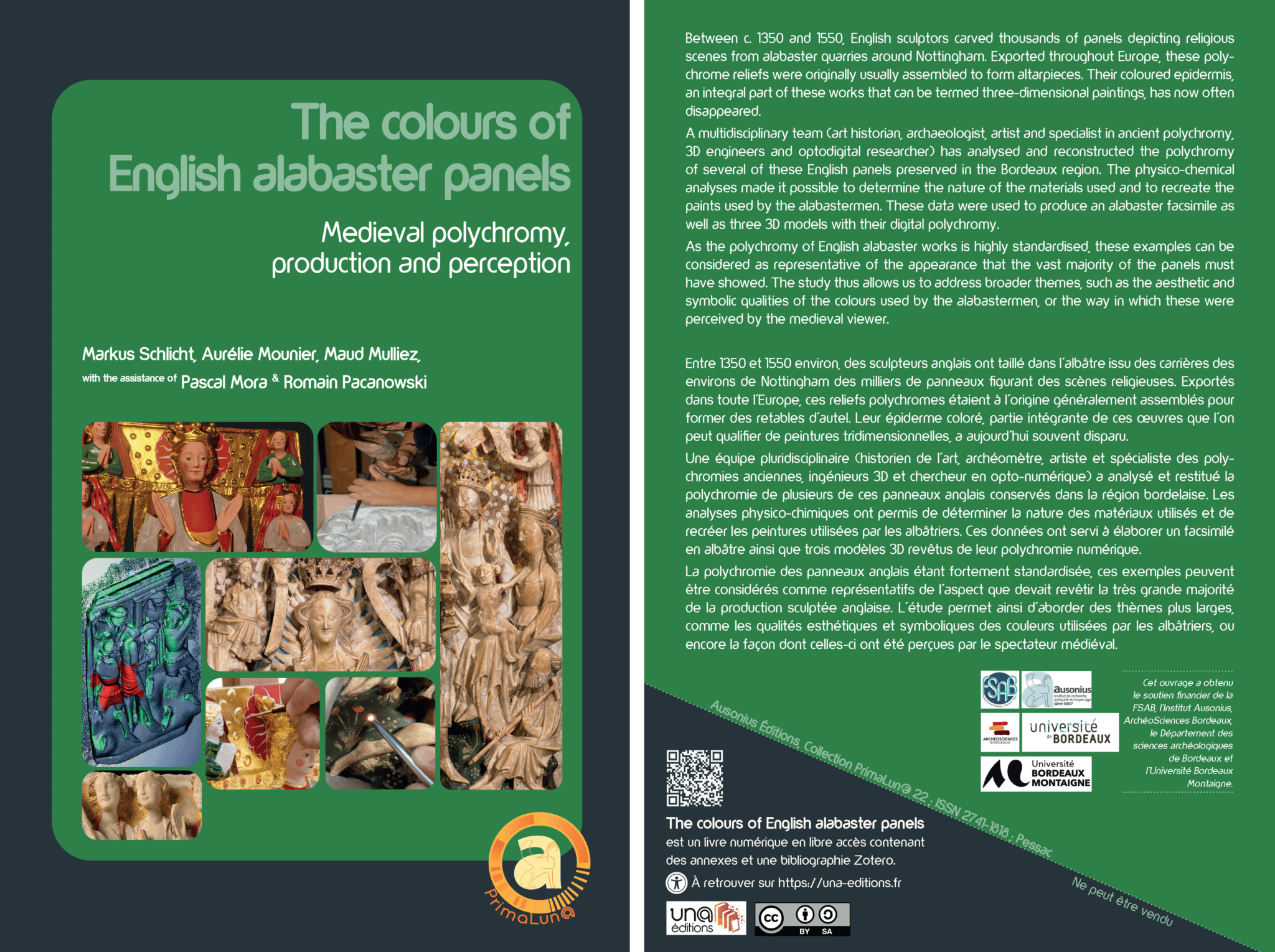


Intimately combining plastic forms and colours, English alabasters can be termed ‘three-dimensional paintings’. Both components of the works of art contribute equally to the encoding of the religious message they convey and disseminate. The total or partial loss of their coloured epidermis, which is frequent today, is therefore equivalent to a partial destruction of the works. This loss no longer allows their aesthetic and symbolic qualities to be properly appreciated. Hence the need to reconstruct their medieval polychromy in order to recover this lost data, at least in part. This was the principal objective of the present study: to retrieve the colours of three of these panels preserved in the Bordeaux region.
This ambition is not without its problems, both technical and epistemological. The approach combining the views of specialists from different disciplines seemed to us to be the best way to overcome them.
Firstly, non-invasive physico-chemical analyses, carried out on the entire corpus of narrative panels from the Bordeaux region – some twenty of which still retain remnants of polychromy – made it possible to determine the materials used for the painting. These analyses showed that the painters of the English alabaster panels used lipidic binders (of the linseed oil type) and a limited range of colours, composed of cinnabar red, copper green (resinate or acetate), deep blue (azurite or indigo) and, in small quantities, lead white. This range of colours is completed by the white of alabaster and the brilliant yellow of gilding (layered on mixtions tinted with red or yellow ochre). Alongside this omnipresent pentachromatic palette, other colours and pigments were used more sporadically: carbon black, various red ochres, red lead, organic yellow, etc. The pigments hardly seem to have been mixed with each other – with the exception of pink, which is often composed of cinnabar and lead white – and are characterised by the intensity of their tone.
These results are very much in line with those obtained in other archaeometric studies of English alabaster panels from places as diverse as the Spanish Basque country, Normandy and Gdańsk, or museums in London and Glasgow. Although their number is too small to be representative of the entire corpus of alabasters, these studies nevertheless confirm that English painters regularly used a limited range of highly saturated colours, produced with the same materials and pigments.
In the course of the research project, paints imitating those used in the Middle Ages – based on the results of the physico-chemical analyses – have been reproduced. The different configurations found on the panels led to the creation of over eighty samples. They allow the exploration of the material qualities of the paint, its texture and the surface effects it produces.
The colours were applied directly to the alabaster. The whiteness of the support and the absence of undercoats increased the brightness of the colours, and the lipidic binder (probably linseed oil) provided brilliance. The painted surfaces are homogeneous and opaque. Generally speaking, mineral pigments (ochres, cinnabar, azurite, etc.) adhere more easily to the support and form more homogeneous layers than organic pigments and these properties may have played a role in their being selected. In the end, the painters of the alabaster slabs show a preference for brilliant, or at least satiny, colours: medieval thinkers considered brilliance as an active emission of light and, as such, associated it symbolically with the divine.
In order to better understand the chromatic universe and the organisation of colours within a panel, an alabaster facsimile was carved. During the cutting of the block it became easier to understand the different stages in the creation of the sculpture. It was also possible to grasp how the physical qualities of the stone, especially its fragility, contributed to the subtlety of the modelling.
Once the panel had been cut, the gold-leaf and the various colours determined by the physico-chemical analyses were applied. The coloured surface of the panel is characterised by its organisation into monochrome colour fields, often surrounded by gold borders, and clearly separated from each other; in general, ‘light’ colours (white and gold) adjoin ‘dark’ colours (red, green and blue). As Michel Pastoureau has noted, although large monochrome surfaces were appreciated, they are almost non-existent in medieval images and are regularly animated with semé or patterns of charges, i.e. geometrised and stylised ornamental forms dispersed regularly over a monochrome surface.1 The ‘daisy’ florets and other ornamental motifs emerge from the background thanks to a similar contrast between light and dark colours.
The colour scheme of the Assumption panel kept in Bordeaux’s Musée d’Aquitaine, used as the model for the facsimile, proved to be atypical of that which characterises the polychromy of the vast majority of the English alabaster production. In order to study more representative examples, some supplementary 3D models were produced.
A first model, specifically that of the Assumption in the Musée d’Aquitaine, made it possible to compare the digital version with the polychrome facsimile of the panel. The most important differences appear in the rendering of the optical characteristics of alabaster and gold: the translucency and brightness of the former, as well as the brilliance of both materials, are difficult to represent digitally. Within the course of the research project, real progress was made in improving the rendering (fig. 47). New tools, such as shaders based on optical measurements – still under development – will one day allow the optical properties of alabaster and gold to be simulated much more accurately.
Two other 3D models, the first reproducing a panel preserved in Libourne, the second a tablet from Saint Michel in Bordeaux, were intended to replicate the usual chromatic universe of English alabasters dating from the fifteenth century.
Although these two panels are characterised by a colour scheme and aesthetic principles that do not differ fundamentally from those of the Assumption panel, the major difference lies in the fact that these principles, applied in a more rigorous manner, are perfectly in line with those used on the vast majority of English panels. To simplify, we could say that they present the typical decorative scheme of fifteenth-century English alabaster: the pentachromatic palette is fully displayed here thanks to the introduction of blue, which is absent from the Assumption, but also from most fourteenth-century panels. The obverse sides of the garments are now uniformly white and systematically edged with gilt hemlines. The linings are exclusively painted red or blue. The characters’ complexions are now immaculately white; pink (and brown?) skin, on the other hand, is reserved for villains. As the visual examination of a large number of other panels, whether in museums or churches, in the Aquitaine region or elsewhere, suggests, these aesthetic principles seem to have been observed by all the English painters with such rigour that we might wonder, each time an alabaster panel deviates from these lines, if we are not dealing with a repaint.

Although the research presented in this book has allowed the reconstruction of the polychromy of three English alabaster panels, much remains to be done. Indeed, these individual panels cannot provide an accurate picture of the appearance of a complete altarpiece, usually composed of seven or nine or even more units. Nor do they take into account all the components of these works, that is to say, the canopies and sometimes the pedestals that frame the panels, the wooden oak chest in which they were housed, also gilded and painted, and finally the inscriptions identifying the scenes depicted. The altarpiece of Munkaꝥverá (fig. 48), typical of the chromatic aesthetics of the fourteenth century, and that of Naples (fig. 70), representative of that of the fifteenth century, still illustrate quite well what has been lost almost everywhere else.

We also did not address the issue of lighting. It is a fact that English sculptors did not exploit the natural translucency of alabaster. The panels are placed in front of an opaque background, in this case a wooden chest devoid of openings. Although the backlighting would have made the alabaster even brighter, the opaque painted parts would have lost much of their brilliance and would have appeared much darker (fig. 71).
It is also difficult to assess the medieval lighting conditions of these works, which were usually placed on the altar of a church. Although this liturgical piece of furniture is often equipped with candles, they do not play the same role as museum illumination for the attractive highlighting of works of art. They do not serve so much to illuminate the space as to symbolise the presence of God, as St. Jerome explains. Hence, he adds, the custom of lighting churches day and night.2 Finally, it should be remembered that, apart from certain exceptional cases, the panels were painted in the workshops of the alabastermen. If they were exported, the painter was probably unaware of the lighting conditions in the church for which the work was intended. In the last analysis, it is the standardisation of the colour scheme itself that most clearly opposes the idea that it could have been individually adapted to the lighting conditions of their final location: alabaster altarpieces in Iceland and Croatia show the same range of colours and the same manner of distributing them over the panels’ surfaces.
As mentioned above, the range of colours used by English painters largely corresponds to the most common medieval classification of colours – white, golden yellow, red, green, blue and black – which in turn is based on Aristotle’s texts on this topic. Like heraldry, English panels hardly admit more than this small number of ‘primary’ colours. However, there is a fundamental difference between the world of alabaster and that of heraldry, namely the exclusion of black. Black, conceived in medieval treatises as a total absence of light, is reserved for the devil and his creatures; in this respect it is opposed to the light that God created on the first day of Genesis. This almost Manichean conception of colours, which the domain of heraldry ignores, shows that the chromatic universe of alabasters is strongly impregnated with clerical culture. The symbolic use of colours is hardly compatible with mimesis, i.e. the imitation of nature. And indeed, on many occasions, the polychromy creates a chromatic universe far removed from reality. The figures in the panels act in a world where the skies are always golden and strewn with gesso nodules, and where the ground is eternally in bloom – even if the scene takes place inside a dwelling. The same stylised florets as those on the soil also adorn objects such as the cross of Christ. The hair shows the metallic glitter of gold, and in the fifteenth century, the complexions of positive figures are immaculately white. But the use of colour is not always governed by this Manichean conception. For example, the armour of the soldiers, who are considered to be vile creatures, is as white and adorned with golden ‘hemlines’ as are the vestments of the saints. Would aesthetic considerations have prevailed here?

The colour schemes of English alabasters, even though they are very particular, are not specific to these works of art. As mentioned above, many of the principles governing their colouring also apply to heraldry. The aesthetic of bright white and gold is also characteristic of fourteenth-century ivory and marble sculpture; one might consider the many sculptures of the Virgin and Child from this period, which combine this white and gold universe with some intense red, blue and green accents (fig. 72). The same aesthetics, taken to the extreme, are embodied in the French enamels in the round from the period around 1400, which combine the bright and brilliant colours – red, green and blue – with the yellow of gold and the particularly pure and unctuous white of enamel. They also feature white complexions, golden hair and golden trims on clothing. It is worth noting that all of these sculptures are distinguished by the bright and shiny whiteness of their material and by their small size; no doubt this particular quality of white and this miniaturisation added to the attractiveness of the works in the eyes of the medieval spectator.
The specificity of English alabaster does not lie in its aesthetic bias, but in the longevity with which it was applied. Indeed, it does not seem to have been modified throughout the fifteenth century, nor probably during the first third of the sixteenth century.3 Even in 1550, this astonishing conservatism clearly did not prevent French clients from buying these works ‘eagerly’, as the English ambassador Sir John Mason noted. In some Italian princely courts, English altarpieces were able to assert themselves in the fifteenth century in the face of potential competition from Renaissance artists, as in the case of the d’Este family in Ferrara, who endowed the private chapel of their palace with an English alabaster altarpiece4. Further research would be necessary to understand the reasons for such choices. In any case, these facts underline the need to place English alabaster panels, despite their singularities, in the wider context of late medieval European art, just as the most recent studies have begun to do.5
Notes
- Pastoureau 1991, 38-40.
- See for instance Dow 1957, 266: “As early as the fourth century Vigilantius ridiculed the burning of lamps in churches during the full light of day, but Jerome justified the practice through its symbolic associations: ‘Throughout the churches of the East when the Gospel is read candles are lighted, although the sun is shining, not for the purpose of driving away darkness, but as an outward sign of gladness… that under the type of an artificial illumination that light may be symbolized of which we read in the Psalter, ‘Thy Word, O Lord, is a lantern unto my feet, and a light unto my paths.’’ St. Isidore, Amalarius and Hrabanus Maurus all used this same justification.” For the Catholic Church, this symbolic meaning still holds true: candles, lamps or sparklers express the light of God that enlightens humanity and are, in this sense, symbols of the revealed truth. [online] https://eglise.catholique.fr/glossaire/cierges-lampes-bougies/ [last accessed on 27 may 2021].
- The Bordeaux region does not seem to have preserved any panels from the sixteenth century, which are characterised by the introduction of clothing details typical of the Renaissance, such as the toques with upturned edges or the square-toed shoes worn by the men, or the voluminous headdresses reminiscent of turbans worn by certain female figures. We have therefore not been able to verify in detail whether the chromatic universe of the alabasters underwent any changes during this last phase of alabaster production.
- See Murat 2016, 410, who refers to eighteenth-century texts according to which the altarpiece now on display in the Palazzo Schifanoia in Ferrara was originally “‘the altarpiece of the domestic altar of the Estensi marquis, rulers of Ferrara’, which is to say that it was the altarpiece of the palatine chapel of the Este family, inside their castle in the city centre of Ferrara.”
- Woods 2018; De Beer 2018; Murat ed. 2019; Brantley et al. ed. 2020.